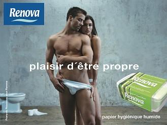
"Could toilet paper actually be the next frontier in affordable luxury? The Europeans and the Japanese are already all over it," writes Dale Hrabi in his latest article for Radar Online magazine.
What's interesting isn't so much the concept of luxury TP, but the way some brands are going to market with their luxury brands. There's obviously work to be done here when it comes to adding value to... well... toilet paper, but our European counterparts seem to have gotten a head start.
There, the logic of "if A=B, and A=C, then B=C" has been adapted to toilet paper: If luxury is sexy and toilet paper is a luxury, then toilet paper is sexy.
(Thanks to Spanish TP maker Renova, I have a whole new appreciation for hanging out in the bathroom now. For the full campaign, follow the link to their "advertising" section.)

What's interesting about Renova's campaign is that the company isn't afraid to come out of the (water-) closet when it comes to toilet paper usage: Their slogan ("the pleasure of being clean") explores the value of toilet paper and hygiene far beyond the realm of simply taking care of #2. It's also about getting close. It's about feeling clean. Renova tells the story of their toilet paper's value in a very unique way, which personally, I find clever and effective (but then again, I'm French).
The point is that the ad creates value, thereby elevating TP above its generic white roll commodity status. It also makes the brand sexy. Very sexy. For that portion of the market that responds well to cK ads, this brand could do quite well.
Are American sensibilities ready for this kind of fresh (and wide-ranging) honesty? That's the million-dollar question.
Whether you find this approach offensive or clever, it works well in Europe... and I would venture to guess that it is just a matter of time before somebody takes a chance wit it in the US and gives babies and teddybears the proverbial boot. The thing is that if you don't like this ad, it's because it isn't aimed at you, and that's okay. The idea behind luxury TP is that it isn't for everyone. It isn't a generic product. It is meant to appeal to a particular segment of the market. You're either in it, or you aren't.
By the way, what does this ad tell you about who (men or women) Renova is primarily aiming their advertising at? (Who actually buys the toilet paper?)
Read all about it here. (It's a short article.)
What's interesting isn't so much the concept of luxury TP, but the way some brands are going to market with their luxury brands. There's obviously work to be done here when it comes to adding value to... well... toilet paper, but our European counterparts seem to have gotten a head start.
There, the logic of "if A=B, and A=C, then B=C" has been adapted to toilet paper: If luxury is sexy and toilet paper is a luxury, then toilet paper is sexy.
(Thanks to Spanish TP maker Renova, I have a whole new appreciation for hanging out in the bathroom now. For the full campaign, follow the link to their "advertising" section.)

What's interesting about Renova's campaign is that the company isn't afraid to come out of the (water-) closet when it comes to toilet paper usage: Their slogan ("the pleasure of being clean") explores the value of toilet paper and hygiene far beyond the realm of simply taking care of #2. It's also about getting close. It's about feeling clean. Renova tells the story of their toilet paper's value in a very unique way, which personally, I find clever and effective (but then again, I'm French).
The point is that the ad creates value, thereby elevating TP above its generic white roll commodity status. It also makes the brand sexy. Very sexy. For that portion of the market that responds well to cK ads, this brand could do quite well.
Are American sensibilities ready for this kind of fresh (and wide-ranging) honesty? That's the million-dollar question.
Whether you find this approach offensive or clever, it works well in Europe... and I would venture to guess that it is just a matter of time before somebody takes a chance wit it in the US and gives babies and teddybears the proverbial boot. The thing is that if you don't like this ad, it's because it isn't aimed at you, and that's okay. The idea behind luxury TP is that it isn't for everyone. It isn't a generic product. It is meant to appeal to a particular segment of the market. You're either in it, or you aren't.
By the way, what does this ad tell you about who (men or women) Renova is primarily aiming their advertising at? (Who actually buys the toilet paper?)
Read all about it here. (It's a short article.)
3 Responses to “Royal Flush”
Leave a Reply
ATOM 0.3
- Helping companies fine-tune their:
- - Relationship with their customers
- - Branding and marketing strategies
- - Communications architecture
- - Reputations and buzz-worthiness
- - Creativity and market relevance
- Office: 864.289.4557
- Mobile: 510.284.9893
- Bat Phone: 864.630.7398
-
- email me
-

- Disclaimer: The opinions expressed in this blog are my own and not necessarily those of SYNNEX or any of its affiliates and partners. Subscribe to the BrandBuilder blog

Previous posts
Previous posts

- August 2005
- September 2005
- October 2005
- November 2005
- December 2005
- January 2006
- February 2006
- March 2006
- April 2006
- May 2006
- June 2006
- July 2006
- August 2006
- September 2006
- October 2006
- November 2006
- December 2006
- January 2007
- February 2007
- March 2007
- April 2007
- May 2007
- June 2007
- July 2007
- August 2007
- September 2007
- October 2007
- November 2007
- December 2007
- January 2008
- February 2008
- March 2008
- April 2008
- May 2008
- June 2008
- July 2008
ATOM 0.3


I'm sorry what did you say?
There's a eye-candy with a huge package in front of me, it's hard to focus on much else.
You should see the rest of their ads. :D
It occured to me yesterday that this photo (which is clearly aimed at women shoppers) is set-up like a mirror image. It's kind of hidden behind layers of six-pack abs, skin-like textures and "pretty", but it's there, as clear as day. That's why the ad is so effective: It creates a first-person fantasy for its intended audience (women).
The reason why the female model is mostly hidden and looks straight into the camera is so that women who look at the ad can relate to her directly without being distracted by her looks. On a subconscious level, she's the fantasy mirror-image of you. (Her appearance is completely irrelevant, by the way.) Look into her eyes, and the male model, the context of the situation and the product suddenly become more vivid and personal to you.
Though the woman is mostly hidden, she has the power position in this ad, which adds to the potency of its sexual message.
Layer 1: The ad catches your eye by showing you a hot looking guy (and yes, his package).
Layer 2: The ad puts you right in the middle of the fantasy it sells.
Layer 3: The ad empowers you sexually... and influences you to buy Renova products to perpetuate your ownership of that empowerement.
There's more to it than that, of course, but still. It's very cleverly done.
I don't know if Renova has ever tested this ad as part of a P.O.P. display, (as opposed to just print and billboard ads) but I bet they would see some serious results.
Thanks for the comment. :)
This is really funny because you have this image and the function of it down to a marketing science. You describe it well and how you suggest i go about looking at it again is quite effective.
Then i think of the sole purpose of toilet paper. To wipe your ass. And then i think of what needs to be wiped from an ass. Then all of the sexual empowerment goes away.
That is until i look at the ad again. :D
Great Stuff, Mate!